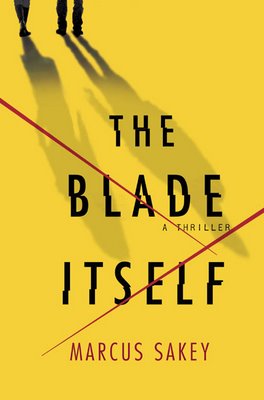
I have a confession. I judge books by their covers. All the time.
Life’s short, and there are a lotta books out there. I average about two a week, and I’m 32 years old. That means statistically, I’ve got about 4500 more books before my library card is permanently revoked. 4500. That’s all. But according to MJ Rose, a woman who’d know, there were about 175,000 books published last year.
So weaning isn’t a choice. It’s a necessity. And one of the first methods of weaning, like it or not, is the cover. A cover conveys a lot of information: genre, mood, sophistication, audience, even publisher enthusiasm can all be read in a quick glance at a cover. Plus, the right cover jumps out at you, leaps off the table like it’s got springs and says, “Take me home, pour a drink, and settle in for the night.”
All of which is on my mind because my cover is now finished.
It’s seemed like a long wait. Not because the folks at Minotaur took a particularly long time, but rather because, well, I have this thing about immediate gratification, and I signed my contract last October. Plus, in a former life I used to own a graphic design shop, so I’m particular about things like Swiss grids and kerning and negative space, especially as they apply to the cover of my debut novel. So while my editor was very patient, I suspect I drove him a little loco.
Anyway, one Monday about a month ago, he called to say he’d FedExed a comp, and that I’d have it on Wednesday. Two days from then.
He’s got a mean streak for being such a nice guy.
When the package finally arrived, I had to take a deep breath before I opened it. Part of me wanted something clean and cutting edge, like the cover of ID Magazine or the sexiest of the literary quarterlies. Part of me wanted it dark and moody, so gritty you came away with dirt under your fingernails just from picking it up.
But the truth was, I really had no idea what would work, what would make my book stand out or sell more copies. Jacket design is a subtle, complicated art. So I tried to just clear my head and look at it without preconception.
Which is the best way to fall in love.
Here it is, my friends, the approved cover of THE BLADE ITSELF, coming this January:

Any thoughts? I'd love to hear 'em. Drop a comment for me.


9 comments:
Hi Marcus, a couple of years ago I bought a novel by a well known writer on a whim simply because of the cover. The cover was simple, yellow on black. I've just grabbed it off the shelf. It's still impressive. It's one of the few books I've bought primarily because of the cover.
Ergo, your cover's great.
PS the novel was Yellow Dog by Martin Amis. Not his best but still worth a read.
Almost all of my covers were lurid. Usually a woman in danger with her dress falling off. Otherwise they would never have sold. Tenticles too. Lots and lots of tenticles.
Emerson LaSalle
Someone told me that yellow pops off the shelf. Immediately draws the eye. Your cover does that. I love the elegant, scary simplicity of the cover.
Great cover. :)
I had a yellow St. Martin's cover on one of my books, too...but mine also had a giant penis on it. Yours looks much better.
Your cover cuts to the quick.
Great cover, Marcus. Pefect feel for the kind of story you're telling. St. Martin's just gets it, don't they?
I was a little surprised by my own cover at first, but then I realized that they really had nailed it. Came up with the kind of cover that makes you want to pick up the book.
But it's usually the title that attracts me first. I spend a lot of time in the shelves, looking at book spines and when I see a title that grabs me, THEN I look at the cover.
But who worries about actually reading the books. I have thousands of books I'll never have the time to read. But I just like having them. Then I can be selective with my OWN library and rediscover those wonderful covers every couple years.
Thanks, folks! I'm very happy with it. And I think it will really pop off the shelves.
Though not as well as a giant penis or a be-tentacled beast would. Or while we're at it, a tentacled penis. That would really catch the eye.
Not sure how it fits the book, though.
I would go to that cover like a magnet--even if I weren't already intrigued by your book. The yellow. The sophistication. The subtle menace. It's perfect.
Love the cover, Marcus. As also a graphics guy, I tend to think the clean look always works best. And yellow is a particularly good color...really stands out.
Good job all around!
Post a Comment